Why My Offer Isn’t Converting
9 Simple Fixes You Can Do Today

Ever poured your heart into building an offer, crafted emails, polished a page, maybe even recorded a slick video, only to stare at crickets for company? Yeah, I’ve been there. You launch your deal, hit “go,” then promptly go make a coffee (or five), expecting the world to beat a path to your checkout. Instead… nothing. Zip. Nada.
If your “why my offer isn’t converting” alarm bells are ringing, stick around, because you might be ignoring some of the sneaky conversion killers hiding in plain sight. Below are nine of the most common reasons offers flop, how to spot them, and exactly what to do so you can flip the script. This isn’t fluff, it’s your guide to real Internet Profit Success.
1. Low or No Traffic to Your Offer
Let’s start simple, if no one’s seeing your page, then conversion doesn’t matter.
Imagine you build a beautiful landing page, but only ten people ever visit. Even if every one converts, that’s still just ten signups or sales. Not enough to move the dial.
Many folks launch with zero traffic plan and then scratch their heads when nothing shows up. If you haven’t mapped out how to get eyeballs, you’re skipping step one.

Here’s how to fix it:
Track visits daily with Google Analytics or whatever platform-insights you use. Set a realistic traffic goal.
Share your offer link where your audience hangs out, niche forums, communities, social‑groups, places with real people who care about your niche.
If you have a budget, run a low-risk ad test (even £5–£10) to validate demand.
Further Reading: Good to Great Marketing Strategies That Fuel Internet Success.
In one case, a creator barely saw ten visits a day. After posting the link in a niche forum, they got 100 new visitors in 48 hours, and signups doubled. That’s the kind of momentum you need to fuel Internet Profit Success.
2. Low Time Spent on Offer Page
You might have decent traffic, but if people bounce immediately, they’re not buying. Why? Because your page failed to grab and hold attention.
Maybe the headline sucks. Perhaps the copy doesn’t speak to the right pain points. Maybe the page is a dog-slow slug to load.

Fixes:
Use Analytics to check “average time on page.” If it’s seconds, you’ve got a problem.
Improve the first impression: Tighten your headline, open with a bold benefit statement, maybe even drop a short explainer video or a compelling image to hook visitors.
Speed things up: Compress large images, simplify design, use a fast host.
One coach added a 60‑second explainer video at the top, and average time on the page doubled, soaring past two minutes. That extra engagement alone helped convince more people to stick around and consider buying.
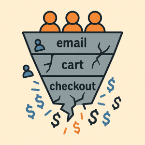
3. High Drop Off in the Email Sequence or Cart
So people click into your funnel or cart, but many don’t complete. That’s a red flag.
The death-by-funnel can happen for many reasons, too many form fields, missing social proof or guarantee, surprise costs, or confusing instructions.
What to do:
Run through the whole flow yourself, like a first-time buyer. Watch for moments where even you hesitate or think. “Really? I have to enter my phone number AND card for this?”
Simplify everything: Only ask for essential info. Do you really need their phone number up front? Probably not.
Add trust signals early: Guarantee statements, FAQ sections, simple copy explaining ROI or value.
One marketer scrapped optional phone fields and slapped in a “30‑day money-back guarantee.” Drop-off dropped by 30%. That’s not luck, that’s clarity + trust + ease.
4. Low Open or Click Rate in Follow-Up Sequence
Maybe people sign up, but then your follow-up emails flop. If your nurture sequence gets ignored, your offer might as well be invisible.
Your problem might be lazy subject lines or vague, uninspiring messaging. Or you’re not giving them a reason to open or click again.
Fix it:
A/B test subject lines: Try curiosity hooks, benefit-driven angles, value-first messaging.
Lead each email with a quick tip or insight, something value-packed from the get-go that makes readers think, “Hmm, maybe this guy knows what he’s doing.”
End with one clear CTA. Don’t clutter it. Make it obvious: “Watch the replay,” “Grab the bonus,” “Get access now.”
Further Reading: Why Your Emails Go Unread (And Fix Your Open Rate Today)
Also check out: 11 Cold Lead Follow-Up Strategies That Actually Warm Up Your List
In one case, changing subject lines from bland (“Update inside”) to something specific and benefit-led (“How this simple tweak drove me 15 sales”) bumped open/click rates from 3% to 9%. That’s triple the attention, and likely more conversions down the line.
5. Offer Without Obvious Value or Bonuses
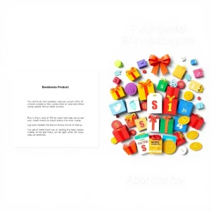
If your offer feels barebones, like “here’s my course, now pay me”, many people will hesitate. People often buy feelings of value as much as the actual product.
High‑value buyers expect extras. A little bonus, template, cheat sheet, workbook, things that make the offer feel richer and more complete.
Try these:
Brainstorm relevant bonuses: Mini workbooks, swipe files, cheat sheets, recordings, extra templates, etc.
Display them clearly, bullets, visuals, maybe even teaser descriptions (“Here’s what you get…”).
Further Reading: 7 Affiliate Earnings Hacks That Let Newbies Crush It Fast
If appropriate, consider limited-time bonuses to create urgency.
For example: One webinar coach added a “30‑day script swipe file” as a bonus, and saw signup conversions shoot up 25%. That turns a “meh” offer into a “holy‑cow that’s a steal” offer.
6. Obfuscated Pricing or Unclear ROI
If customers can’t easily see what they’re paying or what they get in return, they’ll likely bounce. Transparency is your friend.
Make it clear: Show the price in bold near the top, right after the benefit statement. Then help them calculate ROI, how much value are they getting, how much time saved, how much money saved, how much clarity gained.

Also, map costs to results. E.g.: “Just £49 for 30 days of coaching that saves you 5 hours a week”, suddenly the decision becomes easier because it’s about value.
One marketer added a clear price and benefit breakdown, and people converted more because they could mentally justify the investment with clarity.
7. No Social Proof or Testimonials
Humans trust humans. When buyers don’t see anyone else buying or praising the offer, doubts creep in.
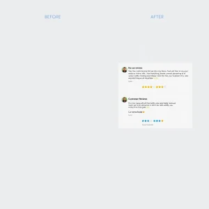
Even five short testimonials can make a difference, especially if you show real results, maybe a before/after, maybe a quick quote with a photo or stat.
Suggestions:
Ask your first handful of buyers for a quick testimonial. Even a simple one-liner works.
Add them right next to your benefits list, or near your CTA. Make them visible.
Update testimonials regularly to keep the page fresh and relevant.
Further Reading: Build a Personal Brand That Converts. 9 Powerful Success Steps
A service provider I know added five quotes + star images to their offer page, and conversions jumped by 15%. That’s just trust + proof doing its job.
8. Page Design Is Cluttered or Hard to Read
If your page looks like a cacophony of colours, fonts, scattered elements, or cramped text, you might as well have written in Comic Sans and called it a day.
Visual clutter kills focus, distracts readers, and hurts credibility. Clean, simple, and easy-to-scan beats flashy-but-chaotic nearly every time.
Here’s how to clean up the chaos:
Simplify layout into 2–3 clear sections.
Use whitespace. Let the page breathe. Don’t crowd text or images.
Use easy-to-read fonts. Highlight benefits and CTAs with bold text, boxes, or colour that feels natural and consistent.
If possible, show the draft to 2–3 unbiased friends, ask them if anything feels overwhelming or confusing.
One blogger redesigned her page with clean sections and a single CTA, and got feedback like “it feels easy to read now.” Conversions climbed because users felt more comfortable sticking around and reading until the end.
9. Unresponsive or Broken Links/Buttons
Even a single broken button or link can kill a sale. We live in the age of mobile, if your buttons aren’t big enough or don’t work on phones, you’re losing a chunk of potential conversions.
What to do:
Test every link, button, and form, on desktop and mobile.
Make sure buttons are thumb-friendly (big enough, spaced enough).
Test checkout flows or form submissions regularly (monthly at least).
I know one seller whose mobile “Buy Now” button was unresponsive, once they fixed it, they recovered roughly 18% of previously lost orders. Just one tiny fix, big returns.

Bonus Section: Don’t Guess, Measure and Test
Here’s the thing: You can guess all you want. But the magic happens when you measure, test, and adjust.
Use analytics, track behaviour, test changes one at a time, and always know which tweaks moved the needle. That’s how you build real, sustainable momentum, the kind of momentum that leads to long-term wins and solid Internet Profit Success.
Why “Offer Not Converting” Happens, Even if Everything ‘Looks’ Fine
Sometimes you’ll look at your page and think, “But it looks great. The copy sounds solid. Price is clear. I even have a testimonial.” Yet… nothing. It still flops.
That’s often because conversion isn’t about just one element, it’s about the entire user experience and trust loop. Search engines (and humans) reward clarity, value, trust, and pages that make people feel confident. If one link is broken, or the button isn’t tappable on mobile, or the offer feels thin, the whole structure crumbles.
Plus: People search, find you, skim, maybe leave, maybe forget. Without testing and measurement, you’ll never know where the leak is, and you’ll never patch it.
How to Use This Post as a Playbook for Internet Profit Success
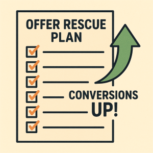
Think of this post as your checklist, your rescue kit, your “offer CPR.”
1. Run an audit of your offer page and funnel, checking against each of the 9 conversion killers above.
2. Pick the biggest issues first, the ones with the biggest impact (traffic, time on page, broken links).
3. Make one change at a time. Track results. Did conversions improve? Great, keep it. Didn’t budge? Undo and try something else.
4. Add value. Add trust. Simplify. Make it easy. Ensure it is clear. Make it human.
5. Rinse and repeat. Because even small tweaks can stack up to big gains.
If you follow this kind of systematic approach, blending clear copy, smart UX, honest value, and a little polish, you’ll turn a flop into a flow. And that’s how you edge closer to real Internet Profit Success.
So, if your offer isn’t converting, don’t panic. It doesn’t mean you suck. It probably just means there’s a small leak somewhere, and with the right checks, fixes, and mindset, you can plug it. Then sit back, rinse, repeat, and watch the magic.
Here’s to your next win. Check out these 5 FREE VIDEOS
