Make Your Content Look Professional: 17 Quick Tweaks
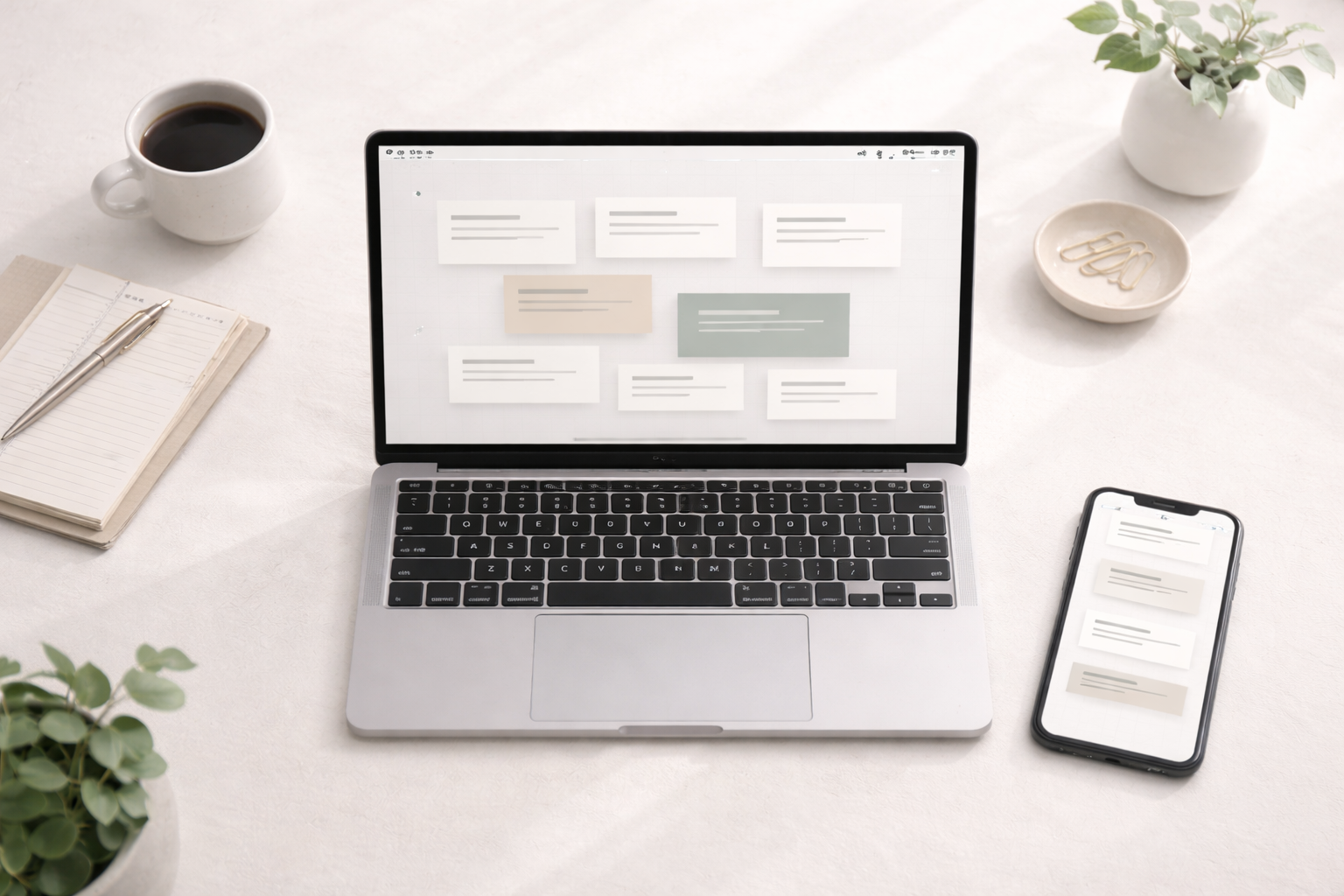
The No-Stress Guide for Beginners

The No-Stress Guide for Beginners
Let’s be honest: most people don’t stop scrolling because your idea is bad. They scroll because your post looks like it was assembled during a power outage with one bar of Wi-Fi and a dream.
Meanwhile, professional-looking content gets the benefit of the doubt. Even before someone reads a single word, clean visuals and clear structure whisper, “This person knows what they’re doing.” On the other hand, messy layouts and random fonts scream, “I just discovered the text tool five minutes ago.”
Here’s the good news. You can make your content look professional without design school, expensive software, or a secret cousin who “does graphics.” In addition, you can do it with beginner-friendly tweaks that work for posts, carousels, reels covers, email headers, blog images, and pretty much anything else that needs to look intentional.
This long-form guide expands the original 10 tweaks into a complete system. Along the way, you’ll see detailed examples, extra tips, and small habits that quietly level up everything you publish. Meanwhile, you’ll also learn how to keep it consistent so your page looks like a brand, not a garage sale.
Why “Polish” Beats “Perfect”
Professional-looking content is really about clarity, not perfection. For example, the cleanest posts usually have one main idea, one visual focal point, and one next step. That’s it. However, beginners often do the opposite: they try to cram five ideas, three fonts, and a paragraph of text onto one graphic and then wonder why it feels “off.”
Polish is what happens when your audience doesn’t have to work hard to understand what they’re looking at. In other words, professional content reduces confusion. It’s easier to read, easier to scan, and easier to trust. As a result, more people stop, engage, and actually follow through on the message. Also, if you want a quick swipe file of first lines that actually pull people in, grab my scroll stopping hooks for engagement guide.
Also, let’s not ignore the real-world benefit: when your content looks clean, you feel more confident posting it. Consequently, you show up more consistently, and consistency is one of the sneakiest growth drivers out there. Meanwhile, a clean look is even more powerful when you pair it with real relationship-building, which is why How to Build Trust With a Cold Audience (11 Simple Ways) is a perfect next read.

1. Start With a Simple “Visual Standard”
Before the 10 tweaks, you need one thing: a basic standard for your visuals. Think of it like brushing your hair before leaving the house. You can still be fun and casual, but the overall look says, “I’m awake and I tried.”
A visual standard means you decide ahead of time what “good enough” looks like for your posts. For example, your standard might be: readable text, consistent colors, plenty of white space design, and no blurry images. Meanwhile, you stop aiming for “award-winning design” and start aiming for “clean and consistent.” That’s where brand consistency starts. And if you want your effort to keep paying you back long after you hit publish, Evergreen Content Types That Build Trust & Last for SEO ties the whole ‘consistency compounds’ idea together nicely.
If you want an easy way to do this, create a quick pre-post checklist in your head. Does the headline stand out? Is it readable on a phone? Are the fonts consistent? Does the layout feel uncluttered? If yes, you’re good. If no, tweak it once and move on.
2. Consistent Brand Colors and Fonts
If you want the fastest upgrade, start here. Consistency is what makes your content feel cohesive, even if your design skills are still loading like a slow website in 2007. When your colors and fonts repeat across posts, people recognize you faster. Additionally, your page looks intentional instead of random.
Choose two or three brand colors and one or two fonts. That’s it. Not seven colors “because they’re cute.” Not five fonts “because variety.” Variety is great at a buffet, not in a carousel.
Just imagine you post a tip graphic with a bold headline font, then a day later you post another graphic with a totally different font and neon colors, and then you post a quote graphic in pastel script. Even if each post looks “fine,” together they look like they belong to three different accounts. On the other hand, when the same headline font shows up again and again, your content starts to feel like a series.
If you use Canva templates, set your fonts and colors once and reuse them. The point is to reduce decisions. Less decision-making means faster creation, and faster creation usually means more consistency.

3. Better Typography Basics
Fonts are basically the outfit your words wear. Therefore, if the outfit is messy, your message feels messy. Typography doesn’t have to be complicated, but it does need a few simple rules.
First, pick one headline font and one body font. For example, a bold sans-serif for headlines paired with a clean, readable font for body text works almost every time. Next, keep your text large enough for phones. If you have to squint at your own post, imagine how your audience feels while walking their dog, holding coffee, and half-reading your content with one thumb. That same rule applies to email too, so if you want plug-and-play examples, Email Subject Line Templates That Drive Higher Open Rates will feel like a cheat code.
Line spacing matters too. Tight lines feel cramped, while comfortable spacing feels premium. In addition, avoid typing in all caps for long sentences. All caps can work for short headers, but long all-caps text reads like someone yelling politely.
Here’s a quick mental test: if your headline can be read instantly from a glance, you’re winning. Meanwhile, if the body text looks like a legal document, it needs breathing room.
4. Adding White Space Design and Clean Layout
White space design is one of those things people don’t notice until it’s missing. When there’s no breathing room, your content feels loud, crowded, and stressful. Conversely, when spacing is generous, the same message feels calm and confident.
White space doesn’t mean your post is “empty.” It means you’re letting the important parts stand out. For example, one strong sentence on a clean background can outperform a slide stuffed with ten lines of text. The brain loves simplicity, and simplicity looks professional.
Try this the next time you build a graphic: create your headline first, then step back and leave space around it like it’s the main character. After that, add supporting text only if it truly helps.
Finally, resist the urge to fill every corner. Empty space is not wasted space. It’s what makes the rest feel intentional.
In addition, clean margins instantly improve layout. If text is hugging the edges, it looks accidental. Give everything a little padding and your design will feel “finished” without you doing anything fancy.

5. Simple Headlines and Clear Hierarchy
Hierarchy is just a fancy word for “the order people read things.” Professional content makes that order obvious. In contrast, messy content forces the reader to guess what matters most.
Start with a short, clear headline. Then, make it visually dominant. That means larger font size, heavier weight, or stronger contrast. And when you want quick title structures you can reuse without overthinking, Headline Formulas That Grab Attention & Boost Clicks] gives you a bunch you can swipe. After that, add supporting text in a smaller size. Finally, if you include a call to action, it should be easy to spot without screaming.
Here’s a practical example. Let’s say your post is about improving content visuals. A clean hierarchy might look like this: a big headline that states the benefit, a short line that explains why it matters, and one small action step. Meanwhile, the chaotic version has the headline, three emojis, two different fonts, a long paragraph, and a tiny “save this” hidden in the bottom corner.
Also, break captions into sections. On the other hand, avoid one long block of text. People scan first and read second. Therefore, structure your writing so scanning is effortless.

6. High Quality Images and Clean Visuals
A blurry image can ruin a perfectly good post in half a second. It’s harsh, but true. Low-quality visuals instantly create a low-quality impression. In addition, stretched photos and pixelated screenshots make content look like it’s been through five group chats.
Use crisp images that fit the vibe of your brand. If you’re using photos, keep them clean and well-lit. If you’re using graphics, stick to simple shapes and modern elements. Meanwhile, avoid mixing five different illustration styles in one carousel. That’s like wearing a tuxedo with flip-flops. Technically possible, emotionally confusing.
Also, pick visuals that support your message instead of distracting from it. For example, if your post is about focus, use a simple visual that communicates calm or clarity. On the other hand, a busy background with ten objects can compete with your text and make everything harder to read.
A tiny trick: add a subtle overlay to photos so text is readable. That little layer can make your content look professional without you changing anything else.
7. Aligning Elements Like You Mean It
Alignment is the quiet hero of good design. When things line up, your brain relaxes. When they don’t, your brain feels like it stepped on a Lego. Consequently, clean alignment makes content feel premium even if the design is simple.
Use grids, guides, or basic alignment tools. Keep text boxes lined up, keep spacing consistent, and avoid the “random floating text” look. If you’re placing multiple elements, align them to an invisible line and let the layout feel organized.
Here’s an easy example. Suppose your carousel has a headline at the top and a sub-point below it. If the left edges don’t match, it looks sloppy. However, if both text boxes share the same left alignment and spacing, it immediately looks intentional.
In addition, consistent padding between elements creates rhythm. Meanwhile, random spacing makes the design feel improvised. Rhythm is what makes your graphics feel like a series instead of a one-off experiment.

8. Minimizing Color Overload
Color is powerful, but too much color becomes visual noise. Professional content typically sticks to a small palette and uses it on purpose. In other words, your colors should feel like a plan, not a mood swing.
Choose a main color, an accent color, and a neutral. Then, repeat them. Your accent color should be used sparingly for emphasis, such as highlighting a key word or a button-style call to action.
For example, a simple palette like navy, white, and a warm accent can look clean and high-end. On the other hand, five bright colors in the same graphic can feel chaotic, even if each color is “nice” by itself.
Also, remember readability. High contrast helps. Meanwhile, light text on a light background is a recipe for squinting. If someone has to zoom in to read your post, they probably won’t.

9. Clean Icons and Simple Illustrations
Icons can make your content easier to scan, but only if they’re consistent. If you mix outline icons, filled icons, 3D icons, and cartoon icons, your design starts looking like a sticker book. Therefore, pick one icon style and stick to it.
Use icons to support your message, not decorate your emptiness. For example, if you list “colors, fonts, spacing,” you can use one small icon next to each. However, avoid adding icons just because you can. You can also eat frosting straight from the tub, but it doesn’t mean you should.
Keep icon size consistent across slides. Meanwhile, make sure they don’t overpower the text. Icons are supporting actors. The headline is the star.
A useful tip: match icon color to your palette. This reinforces brand consistency and helps the design feel unified without extra effort.
10. Keeping Text Short and Scannable
Professional content gets to the point. Long text blocks often feel beginner-ish because they signal unclear thinking. However, short text feels confident because it suggests you know what matters.
Rewrite long sentences into shorter ones. Remove filler words. Break paragraphs into small chunks. Use simple phrasing. Meanwhile, avoid trying to sound “smart.” Clear beats clever almost every time.
For example, instead of “In order to improve the overall quality of your content, it is recommended that you consider implementing consistent typography and spacing,” just say, “Use the same fonts and add more spacing.”
Also, keep lines short on graphics. Long lines of text across an image can be hard to read, especially on mobile. On the other hand, punchy lines are easy to scan. If your audience can understand your main point in three seconds, you’ve done your job.
11. Canva Templates That Standardize Your Look
Canva templates are basically your shortcut to brand consistency. Instead of reinventing the wheel every time, you build a few reusable layouts and rotate them. Consequently, your page starts to look like a brand, even if you’re posting different topics.
Start with three to five template types: a tips carousel, a quote graphic, a simple announcement, a “myth vs truth” layout, and a checklist style. Then, keep the structure the same while you swap the content.
For example, if your tips carousel always has the headline in the same place, the same fonts, and the same spacing, your audience learns what to expect. Meanwhile, you save time because you’re not redesigning from scratch.
Templates also help you avoid “design drift,” where your style slowly changes until your page looks like a different person took over. On the other hand, consistent templates keep you anchored.

12. Adding a Simple, Clear Call to Action
A call to action is just “what happens next.” Professional content guides people instead of leaving them hanging. Therefore, every post should have a clear next step, even if it’s tiny.
Keep it simple, and if you want ready-to-use phrasing for different situations, CTA Templates That Boost Click-Throughs Every Beginner Needs will save you a ridiculous amount of time. Ask people to save it, try it, share it, or read the next slide. Match the call to action to the value you provided. If the post is a quick tip, a small next step is enough. Meanwhile, if it’s a deeper guide, invite them to take a deeper action.
For example, a carousel about design tweaks might end with, “Pick one tweak and use it on your next post today.” That’s easy, clear, and action-based. On the other hand, “Let me know what you think” is vague and doesn’t guide behavior.
Also, don’t hide the call to action in tiny text. Give it breathing room. Make it visible. Then, let the rest of the design stay calm.

13. A Consistent Voice, Not Just Consistent Colors
Visuals matter, but your words also create the “professional” feeling. A consistent voice builds trust because it feels familiar. In addition, it makes your brand feel human, not robotic.
Pick a tone and stick with it. If you’re casual and slightly humorous, keep that energy across captions, emails, and posts. Meanwhile, avoid randomly switching into corporate mode like you’re reading a memo from the Year 2000.
A simple trick: write like you’re explaining something to a friend over coffee. Use contractions. Use clear examples. Keep it grounded. On the other hand, avoid stuffing captions with buzzwords that don’t mean anything.
When voice and visuals match, everything feels more cohesive. That’s a subtle form of brand consistency that people notice without realizing it.
14. Using Better “Before You Post” Editing
Editing is what separates “nice idea” from “wow, this is clean.” Luckily, you don’t need to overthink it. You just need a simple routine.
First, check spelling. Typos happen, but repeated typos create doubt. Next, read your headline out loud. If it sounds clunky, it will read clunky. After that, scan your layout for visual balance. Does one side look heavier? Is there enough white space design? Is the text easy to read?
Then, zoom out. Literally. Shrink the view to phone size and see if the message still pops. If the headline disappears, increase contrast or size. Meanwhile, if everything looks crowded, remove one element instead of squeezing harder.
Finally, stop editing after a reasonable point. Professional doesn’t mean perfect. It means clear and consistent.
Make Your Content Look Professional Across Platforms Without Losing Your Mind
One reason content looks messy is that people design for the wrong platform. A graphic that looks fine on a desktop can look chaotic on a phone. Similarly, a post designed for a square feed can get awkward when cropped for stories.
Design with mobile first. Keep text larger. Leave more margins than you think you need. Avoid placing key words near the edges. In addition, keep important text centered so it doesn’t get chopped in different formats.
If you repurpose content, build a “core design” and adjust it for each platform. For example, your carousel can become a story by enlarging the headline and removing smaller text. Meanwhile, a reel cover should have fewer words than a blog graphic because it has less viewing time. If you’re leaning into short-form but don’t want to be on camera, Faceless Reels Ideas That Build Authority Fast is packed with formats that still look polished.
Consistency across platforms strengthens recognition. When people see your content in different places and it still feels like you, your brand becomes easier to remember.
16 A Simple Content Workflow
A professional look often comes from a professional process. That sounds dramatic, but it’s true. When you wing it every time, your results will look random. On the other hand, a simple workflow makes your output more consistent.
Start by choosing your topic and your main point. Next, write your headline. Then, draft the content in plain text before you design. This prevents you from designing first and then trying to squeeze messy ideas into a pretty box. And if your polished post sends people to a signup page, High Converting Landing Page Elements That Boost Sign-Ups will help you keep that same clean, clear vibe all the way through.
After that, plug the text into your Canva templates. Keep the same fonts, colors, and spacing. Finally, do your quick edit check and schedule it.
This process also helps if you’re building a long-term goal like Internet Profit Success, where showing up consistently matters. Even if you’re not trying to be a designer, your content can still look polished enough to build trust.
17. Extra Micro-Tweaks That Add Instant Polish
Once the big pieces are in place, micro-tweaks can make your content look professional even faster. For example, consistent corner rounding on shapes looks cleaner than mixing sharp and rounded corners. Similarly, using the same shadow style across graphics can make everything feel unified.
Spacing is another micro-win. Keep consistent distance between headline and body text. Keep consistent padding around the edges. Meanwhile, avoid stacking text too tightly, especially on busy backgrounds.
Also, be careful with emojis. Emojis can be fun, but they can also make a post feel messy if you use too many. A couple is fine. A parade is… a choice.
Finally, keep your file naming and organization simple. It’s not glamorous, but it saves time. When you can find your Canva templates quickly, you’re less likely to create new random styles out of frustration.
Common Mistakes to Avoid
Even with the best intentions, a few habits can sabotage your look. One big mistake is using too many font styles. Another is shrinking text to fit instead of cutting it down. Meanwhile, inconsistent colors make your feed look like it’s wearing mismatched socks.
Clutter is another common issue. People add extra shapes, extra icons, extra lines, and extra text because they think it adds value. However, most of the time it adds noise. Removing one element often improves the post more than adding three.
Low contrast is also sneaky. Light gray text on a white background might look “aesthetic,” but if people can’t read it quickly, they’ll scroll. On the other hand, clear contrast looks confident and accessible.
Finally, don’t ignore alignment. Misaligned elements are the fastest way to make something look amateur, even if everything else is good.
A Quick “Upgrade in 15 Minutes” Plan
If you want a fast win, focus on three things: brand consistency, white space design, and readable typography. First, pick one Canva template and lock in your colors and fonts. Next, increase spacing around the text and remove one unnecessary element. Then, make sure the headline is bold and easy to read on mobile.
After that, swap any blurry image for a clean one. Finally, align everything neatly and add a simple call to action.
That’s it. You don’t need ten hours. You need one focused pass. Meanwhile, as you repeat this process, it gets faster and easier. Consistency compounds, and suddenly your content starts looking professional on autopilot.
FAQ for Real Humans
How often should I change my style? Not often. It’s better to keep a consistent look for a while so people recognize you. However, small improvements over time are fine, especially if you keep the same core fonts and colors.
Do I need fancy design elements? Nope. In fact, simple design usually performs better because it’s easier to read. Meanwhile, fancy elements can distract from the message.
What if I’m not “creative”? Good news: professionalism is mostly structure, not creativity. Templates, alignment, and clear hierarchy do the heavy lifting.
Should every post match perfectly? Not perfectly, but consistently. Think of it like an outfit wardrobe: different clothes, same style. That’s brand consistency in real life.

Make Your Content Look Professional: The Takeaway
Making your content look professional is not about complicated design tricks. It’s about clarity, consistency, and a little restraint. Choose a simple palette. Use consistent fonts. Lean on Canva templates. Embrace white space design. Keep text short. Align your elements. Use clean visuals. Add a clear call to action.
Most importantly, build a repeatable process so your content gets better without becoming a full-time job. Even if you’re a beginner, these tweaks will make your posts feel more credible, more readable, and more intentional. In addition, if you want to prove the glow-up is working (instead of just feeling it in your soul), Marketing Metrics for Beginners: 7 You Must Track Today shows what to watch
So go ahead and pick two or three changes to apply today. Meanwhile, don’t stress about doing everything at once. Professional is built one clean post at a time, and honestly, that’s way more fun than trying to be perfect.